Thursday, 29 September 2016
Planning: Company Name and Logo
Morgan, Amy and I have come up with Rebel Records as our company name. The alliterations makes it easily roll off the tongue and is more memorable than some of the other names we came up with like Sky Records or Solo Records. We're still deciding and developing some of the samples for the company logo but will create another post as soon as we have the finished product.
Research: Hair and Makeup Mood Board

 To get the video started, my group and I have decided that we are going to produce a natural looking face of makeup on Sophia. The progression from minimalistic eye shadows and nude lipsticks to full on red lips and black eyeliner suggests how crazy Sophia is for Zak and heightens the intensity of her obsession for him despite how cruelly he treats her. An example of another music video which used this technique is Taylor Swifts song Blank Space where she gets so jealous and "insane" that she cries off all of her dark makeup leaving traces of mascara lining her tears.
 From top to bottom of my mood board it shows what I think Sophia's makeup should be based around. The top left image is a beautiful nude lipstick which comes off as pure and classy. At the beginning of the video we had the idea off commencing it with an argument so we don't want our star to have too much of a fragile image since she is going to be acting frustrated and confused and for this reason she should have a basic everyday makeup look. Meanwhile, for her hair, since Sophie's hair is naturally very long it gives us a lot of ideas to work with. Her hair shouldn't be too glamourous for the start of the video since she is supposed to be representing the typical teenager so in order to pull off that style she should just brush and/or straighten hair as represented in the top right image.

 Once she starts over-thinking about her situation and getting passionate towards the first chorus we decided it would be the perfect opportunity to showcase the red lipstick. Since red is such a bold colour it will definitely be a statement in one of the most important sections of our video. It will not only look powerful but it will represent her trying to keep strong as she demands "Set me free, Leave me be". The transition from light eye makeup to dark eye makeup will happen simultaneously with the change in lip colour. We like the idea of building up her eyeliner more and more until the last few scenes where she will have smudged lipstick and runny eyeliner.
As I've seen in many music videos and magazine covers red lipstick has been a common occurrence. But different textures and shades of it come acres as different looks. For example, the shiny red lipstick seems like more of a fun going out look and the matte lipstick underneath it looks very serious and elegant. We would have to consider this for planning what style lipstick.
Sunday, 25 September 2016
Group Post: Principle Photography of Locations We Might Use
Amy Johnson's Slidely by Slidely Slideshow
This location is on Grammar School Road in Brigg right at the end of the road. Indya showed Morgan and I this location as it had been considered for the video she was in last year. I believe this location would work for some of the video due to it being a large open space giving us a big area to work with. Also there is the sheltered part with the platform down the middle which could work as it will introduce different level's into the video and make it more interesting.
Thursday, 22 September 2016

Planning: Star Name
After a long time of deciding on what Sophie's star name is going to be we finally decided! There were options like White and Cheetah but none of these seemed to go well with the image we are trying to portray. For example, choosing a name like White didn't seem right as it sounded too similar to Pink's iconic name and Cheetah didn't sound like a singers name.
We thought about standard names and liked the idea much more since it fits in more with the classic conventions of an indie/pop artist, like Ed Sheeran and James Blunt.
Our stars name is going to be Sophia. Similar to Sophie Scutt's actual name but it sounds more like a prestigious stage name. We decided not to give her a last name in order for her so sound more unique, and if she is going to have a mass audience as a fan base it sounds more likely for people to be talking about a Sophia than talking about someone called Sophia Jones.
Planning: Star Image
Colour Scheme:
Red is an extremely passionate colour which is one of the reasons why we chose it as the primary colour. it works well with makeup and clothing as well as contrasting to the black. Not only is it the color of romance and love (what she still feels for her abusive ex) it also represents danger and blood.
Another colour we chose to use is purple since it is the colour that symbolises gloom, sad-feelings and frustration, all of which our star is feeling.
Grey will be used as another colour to represent how dull she feels without his love and the depletion of herself.
Knowing the meanings of each colour has helped me develop a better understanding of what and where we could embed them into our video. All of the major props we use will have a meaning which relates back to the meaning of the colour it is.
-
Gravity- Colour Scheme Mood Board by Slidely Slideshow
- Black
- Red
- Grey
- Purple
Red is an extremely passionate colour which is one of the reasons why we chose it as the primary colour. it works well with makeup and clothing as well as contrasting to the black. Not only is it the color of romance and love (what she still feels for her abusive ex) it also represents danger and blood.
Another colour we chose to use is purple since it is the colour that symbolises gloom, sad-feelings and frustration, all of which our star is feeling.
Grey will be used as another colour to represent how dull she feels without his love and the depletion of herself.
Knowing the meanings of each colour has helped me develop a better understanding of what and where we could embed them into our video. All of the major props we use will have a meaning which relates back to the meaning of the colour it is.
Wednesday, 21 September 2016
Music Video Research 3 (Concrete Angel)
Concrete Angel was a song written about a young girl who is ridden with the effects of abuse caused by her mother. I wanted to analyse Martina McBride's Concrete Angel video since it does a great job at promoting child abuse awareness, a subject close to what my group is thinking about centring our video around. The video was directed and produced by Deaton Flanigen.

The establishing shot sets the scene with a horizontal pan around two rooms where the camera appears to be moving through a doorway. I like how this shows what the two people are doing and contrasts each of their lives by illustrating how isolated the little girl actually is. In one room the mother is sitting in an unmade bed smoking a cigarette whilst her daughter gets ready for school on her own.

As McBride sings the line "She walks to school with the lunch she packed" it visually connects the lyrics to the video. It also looks like the footage has an edit that darkens it to create a depressing look.

There was a really nice transition into a medium close up of McBride herself singing. She is wearing a completely black look including a gothic looking necklace. In this case breaking her country music convention seems to be appropriate due to the tone and subject of the song.

In this shot Flanigen uses a forward tracking shot in order for it to appear as the audience is looking through the eyes of the her teacher. A makeup artist must have been hired to create the bruised look on the girls arms. This grabs the audiences attention because of the contrast between her being so innocent by reading her workbook and having such bruised arms.
 This shot really stood out to me because it shows how truly lonely the girl is by the way the camera is shooting at a long shot angle. It's also a good way to incorporate the setting of the playground to give the audience a better idea that she isn't safe at school let alone at home. It also becomes apparent that Flanigen set the video in Autumn on purpose since the connotations of this season is the transition of the warn part of the year into the cold part of the year. This could also represent the coldness and vulnerability of the little girls life.
 This high angle is perfect to present McBrides gothic style outfit. She is really emotive with her hand gestures as the music picks up. The colour of her long drooped sleeved outfit contrasts well with the brown fallen leaves behind her as well.
I really like this over the shoulder shot of the girl talking to her neighbour. The young boy looks as if he enjoys her company which gives a more positive vibe to the song and video, showing that he is the only thing that can make her happy, he is her only friend. This scene was shot at night in exterior conditions which means studio lighting was probably unnecessary. Before filming, Flanigen would have had to take into account the weather conditions and temperature because it would've wasted a lot of time if they set up for shooting and it was raining (making it impossible to get the footage).

 The climax of the video involves a long shot of some shadows acting like silhouettes as it seems like the mother is beating the little girl. This camera is shooting at a point of view as if the young boy was watching.
The last few seconds of the video is reserved for a Child Help USA advertisement to inform the watchers that they can help people out who are stuck in the same situations as the little girl in the video was. By watching such an emotive video it shows at first glance how much of a struggle some children go through with bullying and abuse which many people don't really see in public. It gives a phone number and a website that you can contact Child Help on which is show in white writing on a black background making it very easy to read.
How this post has influenced my planning and creativity:
- Due to being based around the subject of abuse I liked how they had a hotline with the phone number and website of Child Help at the end of the video.
- Everytime I see shadows being used I think it is a great way to make the audience feel more mystery and suspense, I would love to see if we could incorporate shadows in our video.
- I also like how the actions in the video represent the lyrics she's singing.
- This is a really hard hitting music video and I think it is important to incorporate many of the messages like the final shot to really raise awareness.
Research: Target Audience 1
Young (15-30)
 As Sara Bareilles has quite a young target audience my group have decided that we should make a social page on MySpace.com in order to connect our star (Sophie) with her future fans. I found out that The Arctic Monkey's surprisingly launched their career on MySpace due to it being one of the most popular social networks at the time, and since they have a target audience of around the same age as Bareilles, we thought we should promote Sophie in the same way.
Female

How will we appeal to our female audience? In the same way she appeals to her young audience, Sara Bareilles sings about love and her lyrics are very relatable with the abundance emotions that her songs are about. Female viewers and listeners will recognise that she understands what they are going through and will look up to her as a role model. Sophie will have to portray the image of an average teenager whos voice speaks out for how all young women feel. Unlike what most male audiences like to see (sexualising women), in order to get a bigger female fan base Sophie will have to have a simple and modest image while still looking fierce, fresh and confident. Girls want someone to look up to and to be shown that they are capable of whatever the star is capable of.
Worldwide?
Hopefully Sophie will eventually have a worldwide audience by being on MySpace since it gives her the opportunity to interact with fans on all continents. But by having such a huge mass audience she must comply to what everyone wants to see in a performer. This means being slightly more reserved than artists like Miley Cyrus and Lady Gaga in order to develop a wider audience, but also more outgoing than some of the lesser known indie artists such as YouTube stars.
Tuesday, 20 September 2016
Research: Establishing Shots
Sara Bareilles: Gravity
The original video for the song we are doing begins with a close up pan of some objects that looks slightly like a model of a solar system, which links in with the title.

The original video for the song we are doing begins with a close up pan of some objects that looks slightly like a model of a solar system, which links in with the title.

Christina Perri: Jar of Hearts
This Christina Perri video from her song Jar of Hearts starts with a medium close up shot of herself looking straight at the camera. This is a perfect starting point in regards to this video since it creates a serious and intimidating tone directly to the person she is singing to/about.

P!nk: Try

Rachel Platten: Fight Song


In the video All This Time by Maria Mena a 'pan up' shot is used in the establishing scene. This is a great way to introduce the singer into the video and incorporate a good transition into the video. She is also laid on a bed of bright yellow sunflowers which gives great colour saturation to the shot.

Kehlani: Gangsta
Due to the cross media convergence Kehlani is laid on a floor from the movie Suicide Squad in the establishing shot. This song gives off a mysterious tone with a slow beat so it so by starting with a blurry shot it gives connotations that she has something to hide.

Ariana Grande: Into You
The establishing shot from Into You is similar to P!nk's Try's first shot, however it has the title in the middle of the screen. This is a convenient way of introducing the song before the music starts as it is clearly visible what song the audience is about to listen to.

How this has influenced my planning and creativity:
This Christina Perri video from her song Jar of Hearts starts with a medium close up shot of herself looking straight at the camera. This is a perfect starting point in regards to this video since it creates a serious and intimidating tone directly to the person she is singing to/about.

P!nk: Try
P!nk's music video starts out a lot differently with a long shot of a mountain range. According to the Uses and Gratification Theory some of the young audience may not think much to this, however her adult audience might interpret this as being very meaningful to the song. Since the song and video is about trying your hardest and battling any obstacles in your way, a mountain was used as the establishing shot to show that there has is a situation that the has to tackle (a mountain that she has to climb).

Rachel Platten: Fight Song


Rachel Plattern's introduction to her music video for Fight Song is quite creative in the fact that she uses shadows and a high angle to suggest her vulnerability at the beginning. This is a great contrast to some of her final shots where she has realised her power and determination. These feelings are represented with the use of fire in the background and low angled shots to suggest she has come out of her shell.
Maria Mena: All This Time
In the video All This Time by Maria Mena a 'pan up' shot is used in the establishing scene. This is a great way to introduce the singer into the video and incorporate a good transition into the video. She is also laid on a bed of bright yellow sunflowers which gives great colour saturation to the shot.

Kehlani: Gangsta
Due to the cross media convergence Kehlani is laid on a floor from the movie Suicide Squad in the establishing shot. This song gives off a mysterious tone with a slow beat so it so by starting with a blurry shot it gives connotations that she has something to hide.

Ariana Grande: Into You
The establishing shot from Into You is similar to P!nk's Try's first shot, however it has the title in the middle of the screen. This is a convenient way of introducing the song before the music starts as it is clearly visible what song the audience is about to listen to.

How this has influenced my planning and creativity:
- I like how many of the establishing sots have the song title on it since it shows exactly what song is playing
- I like how it looks when music videos start with landscapes.
- I also like how alot of them start with a blurry effect which sharpens a few seconds later.
Monday, 19 September 2016
Sunday, 18 September 2016
Research: Font Styles for Digipak
Since our group is using a Sara Bareilles' song who is of the indie/pop genre I've been having a look at some digipak's and album art for a variety of other singers within the same genre.
Ingrid Michaelson


I searched for Sara Bareilles on Google and discovered other artist's who people searched for after looking up Sara, and Ingrid Michaelson was one of the artists on the first page. The two women share the same musical genre and their songs focus around the same issues so I thought that the font on Michaelson's CD cover would not only describe her own style but could also be a good representation of Bareilles' style too. The font used on most of her albums is similar to Courier found on Microsoft Word. I like this font because it is very indie as it resembles the font from old fashioned type writers. In the photo to the right Michaelson is shot wearing her album name as face paint on her cheeks. This is a striking look as it grabs the audiences attention as people don't normally wear face paint in public. However in contrast to her album "The Way I Am", the white font on "Be Ok" doesn't work to the same effect due to having such a light background. For my digipack, if I were to use a light font I would make it a necessity to have a dark or black background.
Jason Mraz

 It seems as though "hand writing" type fonts are a common reassurance within indie/pop, as illustrated by Ingrid Michaelson and Jason Mraz. This may be due to having such a young fan base. By making their album font's youthful and fun it helps connect with their fans. Also, the unique font and the white writing make good synergy in order to appeal to the 15- 25 year old audience.
What I've learnt:
Ingrid Michaelson


I searched for Sara Bareilles on Google and discovered other artist's who people searched for after looking up Sara, and Ingrid Michaelson was one of the artists on the first page. The two women share the same musical genre and their songs focus around the same issues so I thought that the font on Michaelson's CD cover would not only describe her own style but could also be a good representation of Bareilles' style too. The font used on most of her albums is similar to Courier found on Microsoft Word. I like this font because it is very indie as it resembles the font from old fashioned type writers. In the photo to the right Michaelson is shot wearing her album name as face paint on her cheeks. This is a striking look as it grabs the audiences attention as people don't normally wear face paint in public. However in contrast to her album "The Way I Am", the white font on "Be Ok" doesn't work to the same effect due to having such a light background. For my digipack, if I were to use a light font I would make it a necessity to have a dark or black background.
Jason Mraz


What I've learnt:
- Many indie/pop artist's use hand-drawn or casual script that look very "DIY".
- White font is popular within the genre.
- In these cases the artists name's seems to be larger then the albums name's.
Group Post: Introducing our Star: Sophie Scutt

Sophie has always had an interest in music and performing ever since a young age and has taken part in many productions including being the narrator in Joseph And His Technicolored Dream Coat, Cagebirds to Aldo Annie in Oklahoma.

When we asked Sophie to be the proformer for our music video she was over the moon and couldn't wait for the project to start. I believe working with Sophie will be a very easy assignment due to her having an extensive list of experience from doing previous shows. She can take direction really well and will listen and take on board the instructions we ask her to do.
Another good quality about Sophie is that she has a great visual appearance for our genre of indie pop. She has also agreed to help as much as she can for the preparation of her costume and to help us find things that will be perfect for the music video. She is not allergic to any makeup and is open to as much creativity as possible when it comes to how we will interpret her image.Tuesday, 13 September 2016
Music Video Research 2 (Gonna Get over You)
Gonna Get over You is one of Sara Bareilles most watched music videos according to YouTube. This video has helped me get so many ideas from different camera angles to outfit changes.


Her makeup throughout the video stays the same as well as her costume in order to make the video feel as if it was filmed continuously without any pauses or breaks although it was due to the many scene transitions. Bareilles makeup is a style we could base the makeup around for our star as it is very bold and gives off an indie rock vibe, perfect for Bareilles other song Gravity.


Monday, 12 September 2016
Research: Ancillary Tasks
Lemonade CD
A lot of my inspiration is coming from Beyonce's Lemonade album since it was released earlier this year and got a lot of positive feedback from all over the world. All of her videos are extraordinary and aesthetically brilliant. Along side of shooting multiple music videos for this album she also did lots of photo shoots for posters, CD inserts and album covers, and there were so many photos to choose from.
CD Insert
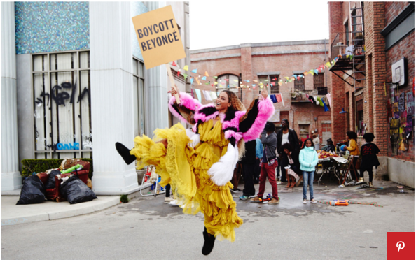
Beyonce's team chose certain photos to be displayed under each song title which represents the mood and tone of the song, such as the fun picture shot in the street of New Orleans (below) for the song Hold Up. Her costume, as well as the setting, is the highlight of this song showing her confidence and success through the way she is positioned dancing and how the dress is flaring with her movement.

Her song Sandcastles is a slow love song from which she got her inspiration off of her husband Jay Z. It makes sense that the art for this song is a picture of polaroids of the both of them spread out on the floor. The polaroid print outs shows that although she is an internationally awarded star she still has a life outside all of the publicity and magazines, and that she has feelings and emotions which come through in the song. Also, I love how in the middle there are separate pictures of the couple where when joined together it makes a full face, symbolising how they complete each other.

The next picture, from her song All Night incorporates her idea of family into her album with a black and white high angle shot. She gives her fans an insight into her family life by including Blue Ivy and Jay Z in her photo shoot. It's a nice way of illustrating the many angles of Lemonade and the different emotions she sings about in the album.

This digipak adheres to many conventions of the common digipak through its use of having many photos which link to her music videos, however breaks conventions by incorporating personal photos of her everyday life and family.
Why this inspired me:
A lot of my inspiration is coming from Beyonce's Lemonade album since it was released earlier this year and got a lot of positive feedback from all over the world. All of her videos are extraordinary and aesthetically brilliant. Along side of shooting multiple music videos for this album she also did lots of photo shoots for posters, CD inserts and album covers, and there were so many photos to choose from.
CD Insert
Beyonce's team chose certain photos to be displayed under each song title which represents the mood and tone of the song, such as the fun picture shot in the street of New Orleans (below) for the song Hold Up. Her costume, as well as the setting, is the highlight of this song showing her confidence and success through the way she is positioned dancing and how the dress is flaring with her movement.
Her song Sandcastles is a slow love song from which she got her inspiration off of her husband Jay Z. It makes sense that the art for this song is a picture of polaroids of the both of them spread out on the floor. The polaroid print outs shows that although she is an internationally awarded star she still has a life outside all of the publicity and magazines, and that she has feelings and emotions which come through in the song. Also, I love how in the middle there are separate pictures of the couple where when joined together it makes a full face, symbolising how they complete each other.

The next picture, from her song All Night incorporates her idea of family into her album with a black and white high angle shot. She gives her fans an insight into her family life by including Blue Ivy and Jay Z in her photo shoot. It's a nice way of illustrating the many angles of Lemonade and the different emotions she sings about in the album.

This digipak adheres to many conventions of the common digipak through its use of having many photos which link to her music videos, however breaks conventions by incorporating personal photos of her everyday life and family.
Why this inspired me:
- I like the idea of incorporating the stars personal life into an album because it is unusual and allows her/his audience to relate to her/him
- The black and white filter on one of her pictures illustrates a variety of styles and gives off an historic look.
Saturday, 10 September 2016
Planning: Blogger App
I just downloaded the Blogger App which will allow me to access my blog 24/7 and will help me to constantly keep you updated on everything I'm doing in regards to our Music Video!
Thursday, 8 September 2016
Catching up with Shot Types

Group Post: Andrew Goodwin
Group Post: Goodwin
Andrew Goodwin had a theory that there are many different types of music video, the main three being performance, narrative and concept. Other styles include animation and combined styles. His theory said that all music videos fit into one of these styles.
A performance music video is where the video shows the artist or band performing their music to an audience, as if they were at a concert. This can be sourced from an actual concert. An artist may use this type of music video as it is the cheapest and easiest to produce, with no money being spent on multiple locations or costumes, or even actors/dancers. An example of this is Bon Jovi's 'You Give Love', where the video is taken at a gig, and their singing is occasionally directed into camera which helps keep the audiences attention.
A narrative music video is where a story is created that weaves around the lyrics of the song. These are more expensive due to having to pay for costumes, props and set. Typically there are also a number of actors involved, and occasionally the artists themselves are featured in the video. An example of this is The All American Rejects's 'Gives You Hell', where the video is centered around the members of the band arguing with their neighbor due to the two houses having people with different personalities.
A concept music video is created to show an idea or a concept that is quite often obscure and not true to real life, rather being relatable to real life. Due these videos being slightly odd in a sense, it interests the audience and draws them in. An example of this is Fall Out Boy's 'Sugar, We're Going Down'. In the video, the boy that is centered around is presented as different from the others due to the use of antlers, which he is shown to be resentful of as people treat him badly because of the anters. No-one actually has antlers which shows that this is concept instead of narrative as it is addressing an issue instead of just portraying a story.
Music Video Research 1 (Hold Up)
Is there a particular music genre or type of music video that you like? If so name it, embed the music video from from youtube and explain why you like it.
In my opinion pop music artists always have the best music videos, despite not being my favourite music genre. I really like how much they have going on in the background and just how much fun they look to shoot, there's always something going on or a story to be told. Even slow pop songs have great videos because they usually feature close up shots and dark dramatic colors which tie into the mood of the song.


In my opinion pop music artists always have the best music videos, despite not being my favourite music genre. I really like how much they have going on in the background and just how much fun they look to shoot, there's always something going on or a story to be told. Even slow pop songs have great videos because they usually feature close up shots and dark dramatic colors which tie into the mood of the song.

The screen grab above shows the artist (Beyonce) in the opening scene of the music video floating in a bedroom full of water which could be a metaphor for how she felt (being drowned in her thoughts) since the first 1.30 minutes she whispers her thoughts on her supposed cheating boyfriend. The dark, neutral colors in this scene work very well with the concept of the song since it creates a mysterious atmosphere which could intimidate the man she is singing about.

The setting rapidly changes once the music starts and Beyonce appears opening some double doors wearing a vibrant yellow gown. This is one of my favourite scenes because it shows a subtle contrast to the one before since she is in a crisp bright setting. This could represent how she is breaking free of all of her hidden emotions and will now show him how she is confident (through the use of the brightly coloured dress), expressive (throughout the action of busting open the closed doors), and not afraid to tell him how she feels (by having the water burst out of the doors).
At this point in the video I realized that this is a concept video since it exaggerates Beyonce's emotions which she would otherwise find hard to interpret in 'real life'.
Somewhere like this setting would be a great location to shoot my own music video because of how extravagant it looks. The stairs in this shot look quite similar to the stairs at a local location called Normanby Hall (see below). This is great because it means that I can almost replicate the effect that Beyonce's music on its audience.


This video is giving me lots of great ideas for shot types and angles for my own. Before I took media I didn't really realise how many different scenes and shots they had to take before producing the final piece. "Hold Up" consists of so many different angles which engages the viewer to the point where they can't stop watching since they're anticipating what is going to happen next.

 |
This angle caught my eye straight away because the bubble gets closer and closer to the camera giving off a sort of 3D effect, it also doubles as a transition into the next scene as the image gets blurrier as the bubble gets closer.

Another fantastic shot was during the first verse where Beyonce is walking down a street in New Orleans holding a baseball bat. At this point she has everyones attention and what's great about this high angle is that it could represent an onlooker peering out his window watching her strut down the path, thus giving off the impression that she is the centre of attention.
Why this video has inspired me:
- The abundance of shot types in Hold Up helped me with deciding what angles to shoot at.
- Beyonce's dress was beautiful in this video and I would like to incorporate a dress with similar material into my groups video.
- Also, the location was exactly what I was thinking of for our video and I think I could replicate it!
A2 Brief and Response
1. A promotion package for the release of an album, to include a music promo video, together with two of the following three options:
- a website homepage for the band;
- a digipak for the album's release;
- a magazine advertisement for the digipak.
Initial thoughts?
I have just joined Morgan and Amy's A2 Media group who've decided to create a digipak, music video and a magazine in order to promote Sara Bareilles song Gravity. Despite being unfamilliar with this song, I will have to carry out plenty of research and watch her music video a lot to understand the atmosphere she wants to portray and the audience she wants to reach out to. Although I've joined the group late I feel like I understand the task at hand quite well since I helped with my friends' A2 media project last year when I appeared in her Music video. By being included in their project it will help me when choosing different shots and settings in my own video.
What are you looking forward to the most?
I'm actually really excited to start putting together all of my ideas from the research I will obtain
Subscribe to:
Posts (Atom)